Banner框架介绍和使用
- 项目源码地址:Banner.kt源码
效果
我们首先看下我们今天要做的效果

轮播图效果图.gif
框架使用
- 详细使用文档:https://github.com/Peakmain/ComposeProject/wiki
Banner(
    data = viewModel.bannerData,//设置数据
    onImagePath = {//设置图片的url地址
        viewModel.bannerData[it].imagePath
    },
    pagerModifier = Modifier
        .padding(horizontal = 16.dp)
        .padding(top = 10.dp)
        .clip(RoundedCornerShape(8.dp)),//HorizontalPager的modifier
    pagerIndicatorModifier = Modifier
        .background(Color(0x90000000))
        .padding(horizontal = 10.dp)
        .padding(top = 10.dp, bottom = 10.dp),//指示器Row的整个样式
    desc = {
        //指示器文本内容,也就是标题一、标题二
        Text(text = viewModel.bannerData[it].desc, color = Color.White)
    }
) {
    //设置item的点击事件
    Log.e("TAG", viewModel.bannerData[it].imagePath)
Banner框架可设置的属性
/**
 * @param data 数据来源
 * @param onImagePath 设置图片的url
 * @param pagerModifier HorizontalPager的Modifier
 * @param ratio 图片宽高压缩比
 * @param contentScale 图片裁剪方式
 * @param isShowPagerIndicator 是否显示指示器
 * @param pagerIndicatorModifier 指示器Row的整个样式
 * @param activeColor 选中的指示器样式
 * @param inactiveColor 未选中的指示器样式
 * @param isLoopBanner 是否自动播放轮播图
 * @param loopDelay 任务执行前的延迟(毫秒)
 * @param loopPeriod 连续任务执行之间的时间(毫秒)。
 * @param horizontalArrangement 指示器Row中文本和指示器的排版样式
 * @param desc 文本内容
 * @param onBannerItemClick Banner的item点击事件
 */
上面是我们已经封装好框架的介绍和使用,那么怎么封装的呢?让我带你一步一步实现它
Banner轮播图的封装实现
- 我们使用的框架是Google的HorizontalPager
- 官方文档:https://google.github.io/accompanist/pager/
- 添加依赖
def accompanist_version = "0.24.7-alpha"
api "com.google.accompanist:accompanist-pager:${accompanist_version}"
api "com.google.accompanist:accompanist-pager-indicators:${accompanist_version}"
- 考虑到对数据进行解耦, 我们把耗时的任务和数据放到ViewModel,这时候我们需要另一些库
def lifecycle_version = "2.4.1"

api "androidx.lifecycle:lifecycle-runtime-ktx:$lifecycle_version"
api "androidx.lifecycle:lifecycle-viewmodel-compose:$lifecycle_version"
api 'androidx.activity:activity-compose:1.4.0'
demo1:HorizontalPager的基本使用
@Composable
fun HomeFragment(viewModel: HomeFragmentViewModel = viewModel()) {
    TopAppBarCenter(title = {
        Text(text = "首页", color = Color.White)
    },
        isImmersive = true,
        modifier = Modifier.background(Brush.linearGradient(listOf(Color_149EE7, Color_2DCDF5)))) {

        Column(Modifier.fillMaxWidth().padding(it)) {
            val pagerState = rememberPagerState()

            HorizontalPager(
                count = viewModel.bannerData.size,
                state = pagerState
            ) { index ->
                AsyncImage(model = viewModel.bannerData[index].imagePath,
                    contentDescription = null,
                    modifier = Modifier
                        .fillMaxWidth()
                        .aspectRatio(7 / 3f),
                    contentScale = ContentScale.Crop)
            }

            Text(text = "我是首页", modifier = Modifier.padding(top = 10.dp))
        }
    }
}
- 通过viewModel: HomeFragmentViewModel = viewModel()进行数据和UI解耦
- TopAppBarCenter是我们上篇文章封装的TopAppBar,大家可以看上篇文章,这里不再阐述
- rememberPagerState记住当前的页面的状态,方法只有一个参数,可以传入初始页面,不传的话默认是0
- HorizontalPager必须传入两个参数,count代表HorizontalPager的数量,pagerState就是上面的rememberPagerState
- AsyncImage用到的是coil库,添加依赖
//图片加载
api("io.coil-kt:coil-compose:2.0.0-rc01")
GitHub地址:https://github.com/coil-kt/coil

效果图.gif
demo2:添加循环轮播
- demo1还是非常简单的,就显示一张图
- HorizontalPager其实就相当于Android中的ViewPager。
- 现在我们滑倒最后一张的时候,实际是不可滑动了,现在想让它在最后一张的时候,再向左滑动显示第一张,怎么解决?
- 官方其实有现成的demo:HorizontalPagerLoopingSample.kt
修改后的代码
@Composable
fun Banner(vm: HomeFragmentViewModel) {
    val virtualCount = Int.MAX_VALUE

    val actualCount = vm.bannerData.size
    //初始图片下标
    val initialIndex = virtualCount / 2
    val pageState = rememberPagerState(initialPage = initialIndex)
    HorizontalPager(count = virtualCount,
        state = pageState,
        modifier = Modifier
            .padding(horizontal = 16.dp)
            .clip(
                RoundedCornerShape(8.dp))) { index ->
        val actualIndex = (index - initialIndex).floorMod(actualCount)
        AsyncImage(model = vm.bannerData[actualIndex].imagePath,
            contentDescription = null,
            modifier = Modifier
                .fillMaxWidth()
                .aspectRatio(7 / 3f),
            contentScale = ContentScale.Crop)
    }
}

 fun Int.floorMod(other: Int): Int = when (other) {
    0 -> this
    else -> this - floorDiv(other = other) * other
}
- 我们设置HorizontalPager数量为整型的最大值
- 初始化显示的位置为整型的最大值的一半,这样数据边界左右就一定有值
- 大家可能对floorMod方法不是很理解
- 我们假设Int.MAX_VALUE=200,那么initialIndex=100
- 图片的大小是4
- 我们第一次进来的index实际就是initialIndex,也就是100
- floorDiv的作用是第一个参数/第二个参数,然后向下取整,如125/25=2
- 如下图,假设我们现在是104,那么它实际下标应该是0,(104-100)-(104-100)/4 * 4,再比如107,下标实际是3=(107-100)-(107-100)/4 * 4
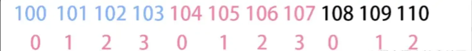
image.png
demo3:轮播图自动轮播
- 上面的代码我们已经实现了图片的左右轮询滑动,现在再添加一个功能,让它自己动起来
- 这里我们需要先讲下Compose的生命周期
生命周期 - 官方网址:https://developer.android.google.cn/jetpack/compose/lifecycle
- LanuchedEffect
- 如果需要在 Compasable 内安全调用挂起函数,可以使用 LaunchedEffect
- LaunchedEffect 会自动启动一个协程,并将代码块作为参数传递
- 当 LaunchedEffect 离开 Composable 或 Composable 销毁时,协程也将取消
- 如果 LaunchedEffect的 key 值改变了,系统将取消现有协程,并在新的协程中启动新的挂起函数
- rememberCoroutineScope
- LaunchedEffect是Compose函数,只能在其他Compose中使用
- 如果想在Compose之外使用协程,并且能够自动取消,我们可以使用rememberCoroutineScope
- 如果需要手动控制协程的生命周期时,也可以使用 rememberCoroutineScope
- DisposableEffect
- 对于需要对于某个值改变时或 Composable 退出后进行销毁或清理操作时,可以使用DisposableEffect
- 当DisposableEffect的 key 发生改变时,会调用onDispose方法,可以在方法中作清理操作,然后再次调用重启
- produceState
- produceState 可让您将非 Compose 状态转换为 Compose 状态
代码实现
基础知识讲完了,那我们就来实现它让它动起来
fun SwipeContent(vm: HomeFragmentViewModel) {
    val virtualCount = Int.MAX_VALUE

    val actualCount = vm.bannerData.size
    //初始图片下标
    val initialIndex = virtualCount / 2
    val pageState = rememberPagerState(initialPage = initialIndex)
    //改变地方在这里
    val coroutineScope= rememberCoroutineScope()
    DisposableEffect(Unit) {
        val timer = Timer()
        timer.schedule(object :TimerTask(){
            override fun run() {
                 coroutineScope.launch {
                     pageState.animateScrollToPage(pageState.currentPage+1)
                 }
            }

        },3000,3000)
        onDispose {
            timer.cancel()
        }
    }
    HorizontalPager(count = virtualCount,
        state = pageState,
        modifier = Modifier
            .padding(horizontal = 16.dp)
            .clip(
                RoundedCornerShape(8.dp))) { index ->
        val actualIndex = (index - initialIndex).floorMod(actualCount)
        AsyncImage(model = vm.bannerData[actualIndex].imagePath,
            contentDescription = null,
            modifier = Modifier
                .fillMaxWidth()
                .aspectRatio(7 / 3f),
            contentScale = ContentScale.Crop)
    }
}
- 创建了一个coroutineScope用来开启协程
- 用DisposableEffect对Compose退出的时候做清理动作
- Timer实际就是定时器,可设置每隔多久执行一次
是不是很简单,我们看下效果

自动轮播.gif
demo4:添加底部指示器
我们已经实现了Banner的自动轮播,那么我们现在就是开始添加指示器
指示器官方有个现成的
- 官方地址:https://google.github.io/accompanist/pager/
- 添加依赖
def accompanist_version = "0.24.7-alpha"
implementation "com.google.accompanist:accompanist-pager-indicators:${accompanist_version}"
- 官方demo:HorizontalPagerWithIndicatorSample.kt,我直接贴了
@Composable
private fun Sample() {
    Scaffold(
        topBar = {
            TopAppBar(
                title = { Text(stringResource(R.string.horiz_pager_with_indicator_title)) },
                backgroundColor = MaterialTheme.colors.surface,
            )
        },
        modifier = Modifier.fillMaxSize()
    ) { padding ->
        Column(Modifier.fillMaxSize().padding(padding)) {
            val pagerState = rememberPagerState()

            // Display 10 items
            HorizontalPager(
                count = 10,
                state = pagerState,
                // Add 32.dp horizontal padding to 'center' the pages
                contentPadding = PaddingValues(horizontal = 32.dp),
                modifier = Modifier
                    .weight(1f)
                    .fillMaxWidth(),
            ) { page ->
                PagerSampleItem(
                    page = page,
                    modifier = Modifier
                        .fillMaxWidth()
                        .aspectRatio(1f)
                )
            }

            HorizontalPagerIndicator(
                pagerState = pagerState,
                modifier = Modifier
                    .align(Alignment.CenterHorizontally)
                    .padding(16.dp),
            )

            ActionsRow(
                pagerState = pagerState,
                modifier = Modifier.align(Alignment.CenterHorizontally)
            )
        }
    }
}
- 我们主要关注HorizontalPagerIndicator,我们发现代码非常简单,设置了pagerState,而这个pagerState就是HorizontalPager的pagerState。
- 这时候大家是不是很高心,这么简单,我直接在我们demo3中AsyncImage的下方直接添加
 AsyncImage(
     model = onImagePath(actualIndex),
     contentDescription = null,
     modifier = Modifier
         .layoutId("image")
         .aspectRatio(ratio)
         .clickable {
             onBannerItemClick?.invoke(actualIndex)
         },
     contentScale = contentScale,
 )
     Row(Modifier
         .layoutId("content")
         .fillMaxWidth()
         .then(pagerIndicatorModifier),
         verticalAlignment = Alignment.CenterVertically,
         horizontalArrangement = horizontalArrangement
     ) {
         desc(actualIndex)
         HorizontalPagerIndicator(
             pagerState = pageState
         )
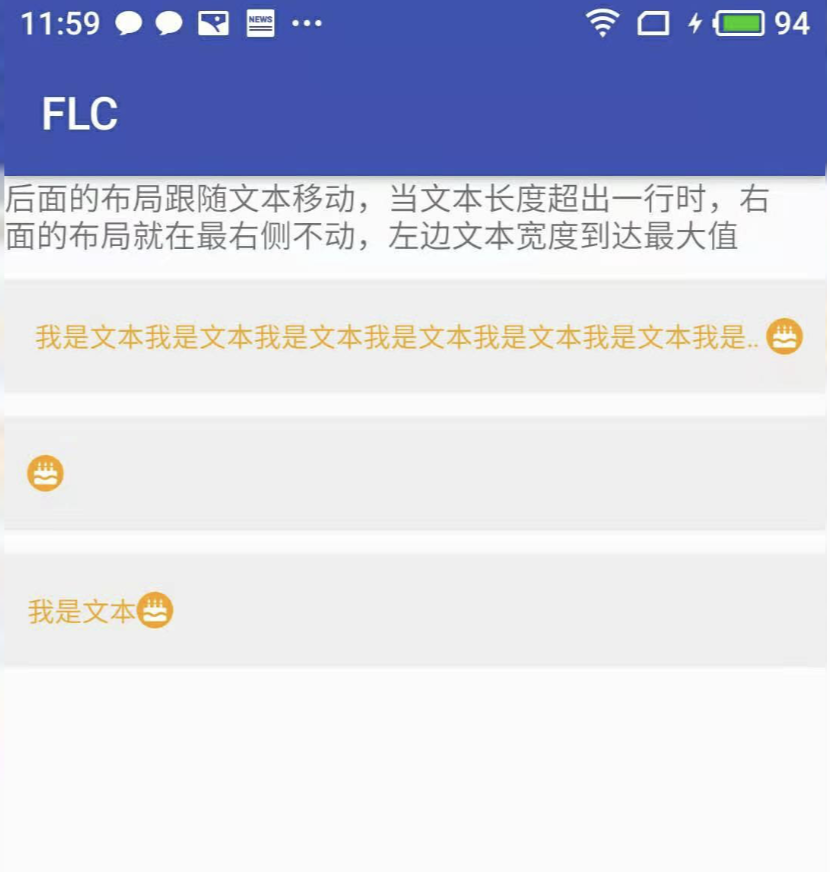
直接运行我们会发现图片展示不出来

image.png
过一会儿程序还崩溃了,what?为什么呢?
- 我们看HorizontalPagerIndicator源码
@Composable
fun HorizontalPagerIndicator(
    pagerState: PagerState,//①
    modifier: Modifier = Modifier,
    activeColor: Color = LocalContentColor.current.copy(alpha = LocalContentAlpha.current),
    inactiveColor: Color = activeColor.copy(ContentAlpha.disabled),
    indicatorWidth: Dp = 8.dp,
    indicatorHeight: Dp = indicatorWidth,
    spacing: Dp = indicatorWidth,
    indicatorShape: Shape = CircleShape,
) {

    val indicatorWidthPx = LocalDensity.current.run { indicatorWidth.roundToPx() }
    val spacingPx = LocalDensity.current.run { spacing.roundToPx() }

    Box(
        modifier = modifier,
        contentAlignment = Alignment.CenterStart
    ) {
        //②
        Row(
            horizontalArrangement = Arrangement.spacedBy(spacing),
            verticalAlignment = Alignment.CenterVertically,
        ) {
            val indicatorModifier = Modifier
                .size(width = indicatorWidth, height = indicatorHeight)
                .background(color = inactiveColor, shape = indicatorShape)

            repeat(pagerState.pageCount) {
                Box(indicatorModifier)
            }
        }
    //③
        Box(
            Modifier
                .offset {
                    val scrollPosition = (pagerState.currentPage + pagerState.currentPageOffset)
                        .coerceIn(0f, (pagerState.pageCount - 1).coerceAtLeast(0).toFloat())
                    IntOffset(
                        x = ((spacingPx + indicatorWidthPx) * scrollPosition).toInt(),
                        y = 0
                    )
                }
                .size(width = indicatorWidth, height = indicatorHeight)
                .background(
                    color = activeColor,
                    shape = indicatorShape,
                )
        )
    }
}
- 我们看注释①
就一个pagerState,而这个实际是HorizontalPagerIndicator的pagerState,还记得之前我们对HorizontalPagerIndicator设置count是多少吗?没错,是Int.MAX_VALUE,我们可能明明就只需要4个点,你给我绘制Int.MAX_VALUE,不肯定崩溃了嘛。 - 注释②就是绘制所有的点
- 注释③就是绘制被选中的点
那么问题来了,现在显示失败或者崩溃的原因是我们设置的数量是最大值,现在我们把它写死data.size,运行起来我们发现不会报错,但是选择的点永远不显示。
既然写死不行,那我们就不用它呗,自己写个指示器呗,多大点事。当然这个方案也是可以的,但是我用的是另一种方案,修改HorizontalPagerIndicator源码
手写HorizontalPagerIndicator
- 我们仔细看HorizontalPagerIndicator源码注释②Row下面有个repeat
repeat(pagerState.pageCount) {
    Box(indicatorModifier)
}
它既然是因为绘制数量太多崩溃了,那我们就将它写成我们数据的大小不就可以了
- 再看注释③,大家可以看到scrollPosition
val scrollPosition = (pagerState.currentPage + pagerState.currentPageOffset)
.coerceIn(0f, (pagerState.pageCount - 1).coerceAtLeast(0).toFloat())
是不是想到了什么?没错pagerState.currentPage就是我们当前选中页面的index,pagerState.pageCount继续改成我们数据的大小。我相信大家肯定已经非常清楚怎么做了,我直接贴源码了
@Composable
fun HorizontalPagerIndicator(
    pagerState: PagerState,
    count:Int,
    modifier: Modifier = Modifier,
    activeColor: Color = LocalContentColor.current.copy(alpha = LocalContentAlpha.current),
    inactiveColor: Color = activeColor.copy(ContentAlpha.disabled),
    indicatorWidth: Dp = 8.dp,
    indicatorHeight: Dp = indicatorWidth,
    spacing: Dp = indicatorWidth,
    indicatorShape: Shape = CircleShape,
) {

    val indicatorWidthPx = LocalDensity.current.run { indicatorWidth.roundToPx() }
    val spacingPx = LocalDensity.current.run { spacing.roundToPx() }

    Box(
        modifier = modifier,
        contentAlignment = Alignment.CenterStart
    ) {
        Row(
            horizontalArrangement = Arrangement.spacedBy(spacing),
            verticalAlignment = Alignment.CenterVertically,
        ) {
            val indicatorModifier = Modifier
                .size(width = indicatorWidth, height = indicatorHeight)
                .background(color = inactiveColor, shape = indicatorShape)

            repeat(count) {
                Box(indicatorModifier)
            }
        }

        Box(
            Modifier
                .offset {
                    val scrollPosition = ((pagerState.currentPage-Int.MAX_VALUE/2).floorMod(count)+ pagerState.currentPageOffset)
                        .coerceIn(0f, (count - 1).coerceAtLeast(0).toFloat())
                    IntOffset(
                        x = ((spacingPx + indicatorWidthPx) * scrollPosition).toInt(),
                        y = 0
                    )
                }
                .size(width = indicatorWidth, height = indicatorHeight)
                .background(
                    color = activeColor,
                    shape = indicatorShape,
                )
        )
    }
}
总结
至此呢,我们对Banner的封装已经全部完成了,大家这时候肯定说:瞎说,pager指示器怎么放到底部的你没说呀,这个就留给大家去思考了,当然,大家可以参考我上篇文章的用到的方法,也可直接看我的源码Banner.kt
资源下载
下载价格免费
下载说明:
1、本站所有资源均从互联网上收集整理而来,仅供学习交流之用,因此不包含技术服务请大家谅解!
2、本站不提供任何实质性的付费和支付资源,所有需要积分下载的资源均为网站运营赞助费用或者线下劳务费用!
3、本站所有资源仅用于学习及研究使用,您必须在下载后的24小时内删除所下载资源,切勿用于商业用途,否则由此引发的法律纠纷及连带责任本站和发布者概不承担!
4、本站站内提供的所有可下载资源,本站保证未做任何负面改动(不包含修复bug和完善功能等正面优化或二次开发),但本站不保证资源的准确性、安全性和完整性,用户下载后自行斟酌,我们以交流学习为目的,并不是所有的源码都100%无错或无bug!如有链接无法下载、失效或广告,请联系客服处理!
5、本站资源除标明原创外均来自网络整理,版权归原作者或本站特约原创作者所有,如侵犯到您的合法权益,请立即告知本站,本站将及时予与删除并致以最深的歉意!
6、如果您也有好的资源或教程,您可以投稿发布,成功分享后有站币奖励和额外收入!
7、如果您喜欢该资源,请支持官方正版资源,以得到更好的正版服务!
8、请您认真阅读上述内容,注册本站用户或下载本站资源即您同意上述内容!
原文链接:https://www.dandroid.cn/19356,转载请注明出处。


评论0