TopAppBar的使用
源码
有两个源码,我们看其中一个
@Composable
fun TopAppBar(
    title: @Composable () -> Unit,
    modifier: Modifier = Modifier,
    navigationIcon: @Composable (() -> Unit)? = null,
    actions: @Composable RowScope.() -> Unit = {},
    backgroundColor: Color = MaterialTheme.colors.primarySurface,
    contentColor: Color = contentColorFor(backgroundColor),
    elevation: Dp = AppBarDefaults.TopAppBarElevation
)
- title:标题
- navigationIcon:左边图标
- actions:右边图标
- backgroundColor:背景颜色
- contentColor:内容区域的颜色,包括Icon,Text等
- elevation:阴影
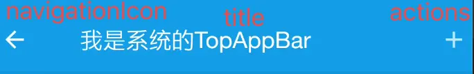
       Scaffold(topBar = {
           TopAppBar(title = {
               Text(text = "我是系统的TopAppBar")
           },navigationIcon = {
               Icon(imageVector = Icons.Default.ArrowBack, contentDescription = null)
           },actions = {
               Icon(imageVector = Icons.Default.Add, contentDescription = null)
           })
       })
上面我们看的是参数源码,我们看下方法体的源码
fun TopAppBar(
...
) {
    AppBar(
        backgroundColor,
        contentColor,
        elevation,
        AppBarDefaults.ContentPadding,
        RectangleShape,
        modifier
    ) {
        if (navigationIcon == null) {//👈🏻①
            Spacer(TitleInsetWithoutIcon)
        } else {
            //👈🏻②
            Row(TitleIconModifier, verticalAlignment = Alignment.CenterVertically) {
                CompositionLocalProvider(
                    LocalContentAlpha provides ContentAlpha.high,
                    content = navigationIcon
                )
            }
        }

        Row(
       //注释③
            Modifier.fillMaxHeight().weight(1f),
            verticalAlignment = Alignment.CenterVertically
        ) {
            ProvideTextStyle(value = MaterialTheme.typography.h6) {
                CompositionLocalProvider(
                    LocalContentAlpha provides ContentAlpha.high,
                    content = title
                )
            }
        }
      //注释④
        CompositionLocalProvider(LocalContentAlpha provides ContentAlpha.medium) {
            Row(
                Modifier.fillMaxHeight(),
                horizontalArrangement = Arrangement.End,
                verticalAlignment = Alignment.CenterVertically,
                content = actions
            )
        }
    }
}
- 我们看到AppBar有个默认padding值是AppBarDefaults.ContentPadding=4.dp,AppBar的默认高度是56dp
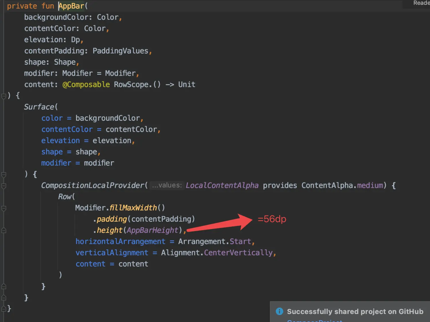 image.png
 - 我们看注释①
private val AppBarHorizontalPadding = 4.dp
private val TitleInsetWithoutIcon = Modifier.width(16.dp - AppBarHorizontalPadding)
我们可以看到,如果左边没有图标,那么它会设置一个12dp的空白区域
tips:Spacer空白区域,通过 modifier 设置空白区域的大小
- 注释②
- 如果左边返回按钮不为空,那么就会执行我们创建的navigationIcon,只是默认设置成了垂直居中
- CompositionLocalProvider大家可以先理解成只是用来传递数据的,后面会介绍到
- TitleIconModifier源码
private val AppBarHorizontalPadding = 4.dp
private val TitleIconModifier = Modifier.fillMaxHeight()
    .width(72.dp - AppBarHorizontalPadding)
设置naviationIcon的大小为68.dp
- 注释③:我们可以看到它实际设置了weight=1,那也就是说,如果有左图标或者右图标,那么文字其实并不会居中,而是填满剩余部分,然后垂直居中
- 注释④,默认是居右,然后有4dp的距离
所以代码其实等价于
     Row(
                modifier = Modifier
                    .fillMaxWidth()
                    .height(56.dp)
                    .background(Color_149EE7)
                    .padding(4.dp),
                horizontalArrangement = Arrangement.SpaceBetween
            ) {
                Row(modifier = Modifier
                    .fillMaxHeight()
                    .width(68.dp)
                    .background(Color.Red),
                    verticalAlignment = Alignment.CenterVertically) {
                    CompositionLocalProvider(
                        LocalContentAlpha provides ContentAlpha.high,
                        content = {
                            Icon(imageVector = Icons.Default.ArrowBack,
                                contentDescription = null,
                                tint = Color.White)
                        }
                    )
                }
                Row(
                    Modifier
                        .fillMaxHeight()
                        .weight(1f),
                    verticalAlignment = Alignment.CenterVertically
                ) {
                    ProvideTextStyle(value = MaterialTheme.typography.h6) {
                        CompositionLocalProvider(
                            LocalContentAlpha provides ContentAlpha.high,
                            content = {
                                Text(text = "我是自定义的TopAppBar", color = Color.White)
                            }
                        )
                    }
                }
                CompositionLocalProvider(LocalContentAlpha provides ContentAlpha.medium) {
                    Row(
                        Modifier.fillMaxHeight(),
                        horizontalArrangement = Arrangement.End,
                        verticalAlignment = Alignment.CenterVertically,
                        content = {
                            Icon(
                                imageVector = Icons.Default.Add,
                                contentDescription = null,
                                modifier = Modifier.background(Color.Blue),
                                tint = Color.White
                            )
                        }
                    )
                }
          }
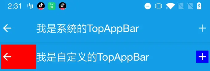
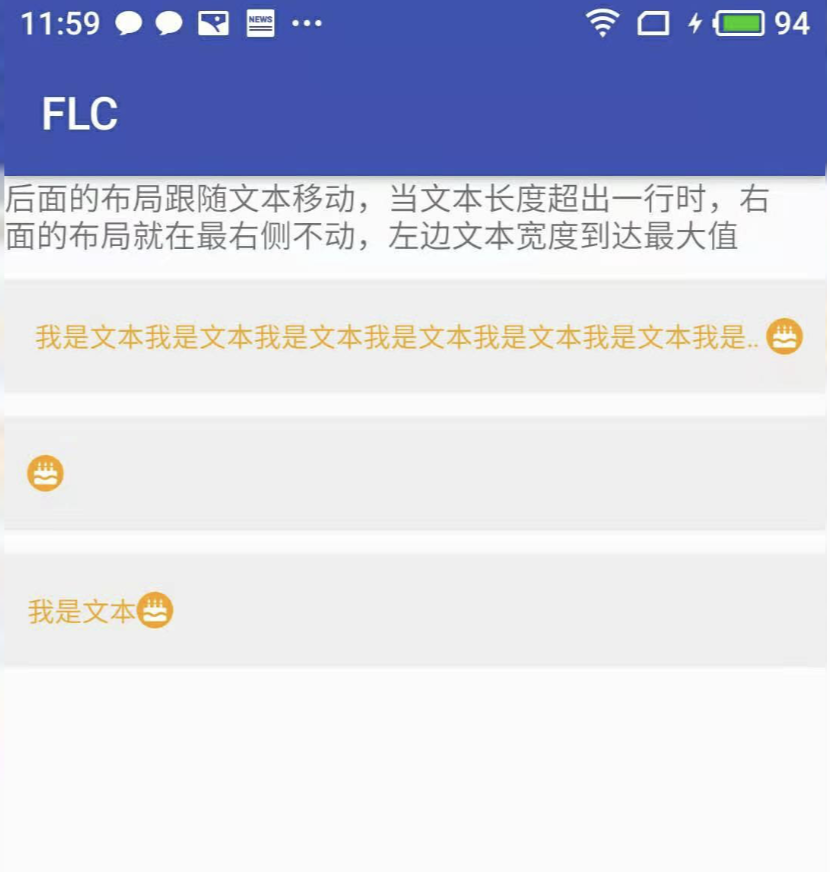
存在的问题
- 想要的效果:首页的文字居中,如下图
 image.png
 - 上面我们分析知道title实际设置了weight=1,当左边有图标的时候,文字设置居中实际是模块居中,而不是标题文本内容居中
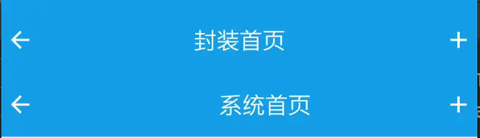 image.png
如上图,”封装首页”其实才是我们想要的效果,”系统首页”是现有的TopAppBar的样式。那么想达到我们想要的效果应该怎么做呢?在封装前我们还需要了解一个控件ConstraintLayout
ConstraintLayout的使用
ConstraintLayout 可以让组件相对屏幕或其他同级组件进行布局,减少 Row、Column、Box 布局的互相嵌套。
想要在项目中使用ConstraintLayout,必须在build.gradle 中增加依赖,我的放在library中
api "androidx.constraintlayout:constraintlayout-compose:1.0.0"
用法:constraintlayout使用有两种方式,我这里主要介绍一种方式,大家可以自行查询你第二种方式
- 给 ConstraintsLayout 设置 ContraintSet
- 通过 createRefs 或 createRefFor 创建引用,每一个组件需要有一个引用
- 通过设置 layoutId 来关联组件
- contraintSet中constrain的body块使用linkto等设置约束
- parent 是默认的父组件的引用,可以直接使用
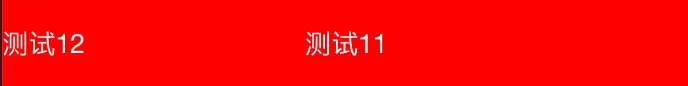
 val constraintSet = ConstraintSet {
     val ceshi1 = createRefFor("ceshi1")
     val ceshi2 = createRefFor("ceshi2")
     constrain(ceshi1) {
         start.linkTo(parent.start)
         end.linkTo(parent.end)
         top.linkTo(parent.top)
         bottom.linkTo(parent.bottom)
     }
     constrain(ceshi2) {
         top.linkTo(parent.top)
         bottom.linkTo(parent.bottom)
     }
 }
 ConstraintLayout(constraintSet,
     Modifier
         .height(56.dp)
         .background(Color.Red)
         .fillMaxWidth()) {
     Text(
         text = "测试11",
         modifier = Modifier.layoutId("ceshi1"),
         color = Color.White
     )
     Text(
         text = "测试12",
         modifier = Modifier.layoutId("ceshi2"),
         color = Color.White
     )
}
效果如图
TopAppBar的封装
结合上面分析,我们的需要注意几点:
1.TopAppBar的高度是56dp
2.TopAppBar的两边的间距是4dp
直接贴代码
@Composable
fun TopAppBarCenter(
    title: @Composable () -> Unit,
    modifier: Modifier = Modifier,
    navigationIcon: @Composable (() -> Unit)? = null,
    backgroundColor: Color = MaterialTheme.colors.primarySurface,
    actions: @Composable RowScope.() -> Unit = {},
    content: @Composable (PaddingValues) -> Unit
) {
   Scaffold(topBar = {
       val constraintSet = ConstraintSet {
           val titleRef = createRefFor("title")
           val navigationIconRef = createRefFor("navigationIcon")
           val actionsRef = createRefFor("actions")
           constrain(titleRef) {
               start.linkTo(parent.start)
               end.linkTo(parent.end)
               top.linkTo(parent.top)
               bottom.linkTo(parent.bottom)
           }
           constrain(navigationIconRef) {
               top.linkTo(parent.top)
               bottom.linkTo(parent.bottom)
           }
           constrain(actionsRef){
               top.linkTo(parent.top)
               bottom.linkTo(parent.bottom)
               end.linkTo(parent.end)
           }
       }
       ConstraintLayout(constraintSet,
           modifier = Modifier
               .fillMaxWidth()
               .background(backgroundColor)
               .height(TopAppBarHeight)
               .then(modifier)) {
           Box(
               Modifier
                   .layoutId("title")
                   .padding(horizontal = 4.dp)
           ) {
               ProvideTextStyle(value = MaterialTheme.typography.h6) {
                   CompositionLocalProvider(
                       LocalContentAlpha provides ContentAlpha.high,
                       content = title
                   )
               }
           }
           if (navigationIcon != null) {
               Box(modifier = Modifier
                   .layoutId("navigationIcon")
                   .padding(start = 4.dp)) {
                   CompositionLocalProvider(
                       LocalContentAlpha provides ContentAlpha.high,
                       content = navigationIcon
                   )
               }
           }
           Row(
               Modifier.layoutId("actions").padding(end = 4.dp),
               content = actions
           )

       }
   }) {
        content(it)
   }

}
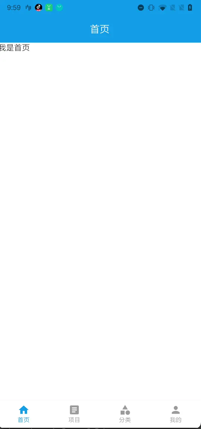
使用就非常简单了
    TopAppBarCenter(title = {
        Text(text = "封装首页", color = Color.White)
    }, navigationIcon = {
        Icon(imageVector = Icons.Default.ArrowBack,
            contentDescription = null,
            tint = Color.White)
    }, actions = {
        Icon(imageVector = Icons.Default.Add, contentDescription = null, tint = Color.White)
    }) {
        //绘制内容区
        Text(text = "我是首页")
    }
沉浸式状态栏
- 首先开启沉浸式状态栏
//MainActivity
//设置沉浸式状态栏
WindowCompat.setDecorFitsSystemWindows(window, false)
- 1、如果是沉浸式状态栏,那么我们需要将状态栏设置透明
- 这里对状态栏设置我们用到Google的库 System UI Controller for Jetpack – Compose
- 添加依赖
    def accompanist_version = "0.24.7-alpha"
    api "com.google.accompanist:accompanist-systemuicontroller:${accompanist_version}"
- 使用
        val systemUiController = rememberSystemUiController()
        SideEffect {
            systemUiController.setSystemBarsColor(
                color = Color.Transparent,
                darkIcons = darkIcons
            )
        }
- 2、获取状态栏的高度,原本TopAppStatus的高度+状态栏的高度
//获取状态栏的高度
 with(LocalContext.current) {
     statusBarHeight =
         resources.getDimensionPixelSize(resources.getIdentifier("status_bar_height",
             "dimen",
             "android"))
 }
 with(LocalDensity.current) {
     statusBarHeightDp = statusBarHeight.toDp()
 }
- 3、设置padding(top=状态栏的高度)
      ConstraintLayout(constraintSet, modifier = Modifier
            .fillMaxWidth()
            .background(backgroundColor)
            .height(topAppBarHeight + statusBarHeightDp)
            .padding(top = statusBarHeightDp) //设置padding(top=状态栏的高度)
            .then(modifier))
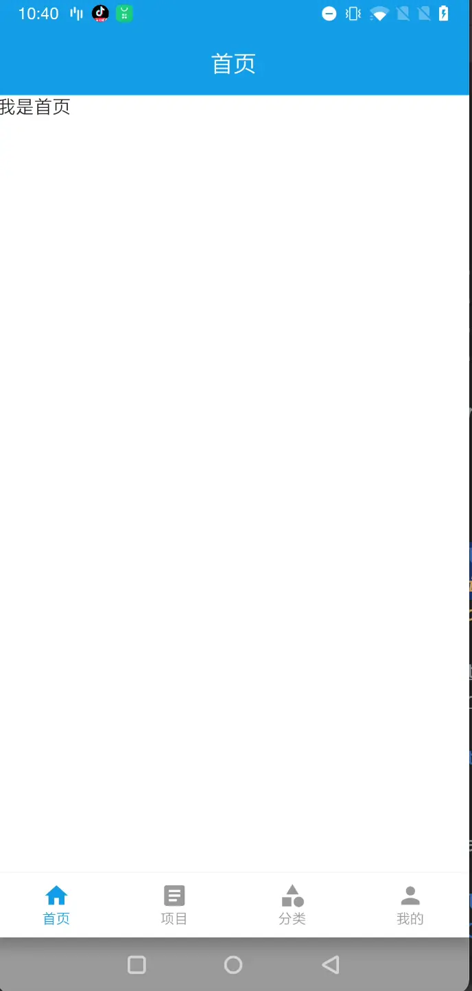
效果如下
但是当我们把虚拟导航栏打开,我们再看看效果

我们我们发现下方的BottomNavigation被挡住了,怎么解决呢?这时候我们需要用到另一个Google的库, Insets for Jetpack Compose
- 添加依赖
api "com.google.accompanist:accompanist-insets:$accompanist_version"
- 修改BottomNavigation,添加modifier
  BottomNavigation(backgroundColor = MaterialTheme.colors.surface
                , modifier = Modifier.navigationBarsPadding()
运行起来看下效果
总结
我们首先对TopAppBar的源码进行分析,我们发现原有的TopAppBar并不能满足我们的需求,于是我们自己重写了一个TopAppBar,使用的技术其实也很简单,主要就是使用到了ConstraintLayout。关于沉浸式呢,我们用的都是Google自带的库,用起来也是非常简单。
至此,我们的TopAppBar的封装已经结束了,下篇将介绍Banner图的使用和封装。
最后贴下TopAppBar的源码地址TopAppBar.kt
1、本站所有资源均从互联网上收集整理而来,仅供学习交流之用,因此不包含技术服务请大家谅解!
2、本站不提供任何实质性的付费和支付资源,所有需要积分下载的资源均为网站运营赞助费用或者线下劳务费用!
3、本站所有资源仅用于学习及研究使用,您必须在下载后的24小时内删除所下载资源,切勿用于商业用途,否则由此引发的法律纠纷及连带责任本站和发布者概不承担!
4、本站站内提供的所有可下载资源,本站保证未做任何负面改动(不包含修复bug和完善功能等正面优化或二次开发),但本站不保证资源的准确性、安全性和完整性,用户下载后自行斟酌,我们以交流学习为目的,并不是所有的源码都100%无错或无bug!如有链接无法下载、失效或广告,请联系客服处理!
5、本站资源除标明原创外均来自网络整理,版权归原作者或本站特约原创作者所有,如侵犯到您的合法权益,请立即告知本站,本站将及时予与删除并致以最深的歉意!
6、如果您也有好的资源或教程,您可以投稿发布,成功分享后有站币奖励和额外收入!
7、如果您喜欢该资源,请支持官方正版资源,以得到更好的正版服务!
8、请您认真阅读上述内容,注册本站用户或下载本站资源即您同意上述内容!
原文链接:https://www.dandroid.cn/19362,转载请注明出处。


评论0