上次介绍了compose中大多数的标准组件,此外还有两个重要的组件:列表LazyColumn和LazyRow,以及约束布局ConstraintLayout,在使用它们之前,先来认识Modifier
修饰符Modifier
Modifier之前已经运用过,它能做的事情很多,不仅仅是改变组件的样式,还能够改变组件的位置,以及自定义交互事件,关于Modifier的所有用法,可以查看官方文档:https://developer.android.google.cn/jetpack/compose/modifiers-list,这边只介绍常用的
一、Modifier顺序
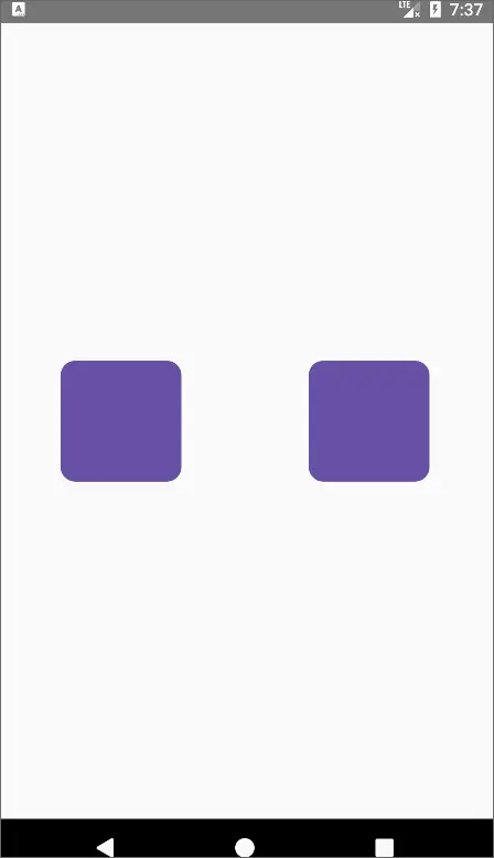
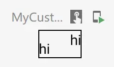
首先我们必须要知道的是:Modifier的设置是有顺序的,下面的代码分别在设置padding之前和之后为Box设置点击事件:
@Preview
@Composable
fun MyModifier1() {
    Row(
        horizontalArrangement = Arrangement.SpaceAround,
        verticalAlignment = Alignment.CenterVertically,
        modifier = Modifier.fillMaxSize()
    ) {
        Box(
            modifier = Modifier
                .size(100.dp)
                .background(
                    color = MaterialTheme.colorScheme.primary,
                    shape = MaterialTheme.shapes.medium
                )
                .clickable {

                }
                .padding(40.dp)
        )

        Box(
            modifier = Modifier
                .size(100.dp)
                .background(
                    color = MaterialTheme.colorScheme.primary,
                    shape = MaterialTheme.shapes.medium
                )
                .padding(20.dp)
                .clickable {

                }
        )
    }
}
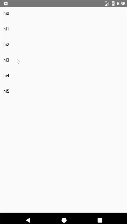
效果如下,左边为padding之前,padding之后,可以看到之后再设置点击事件,整个组件的点击范围变小了:
二、操作
对组件的操作有很多,如点击、长按、双击、拖拽、选中等
1.clickable-点击
clickable之前就使用过了,除了点击外,还有一些其他属性和提供无障碍操作(残疾人)使用:
fun Modifier.clickable(
    interactionSource: MutableInteractionSource,// 只有第一次按下才会发送,并更新状态
    indication: Indication?,// 按下效果 如水波纹
    enabled: Boolean = true,
    onClickLabel: String? = null,//无障碍访问标签
    role: Role? = null,//为无障碍访问描述元素的类型
    onClick: () -> Unit
)
2.combinedClickable-点击、长按、双击
combinedClickable组合了点击、长按、双击:
@ExperimentalFoundationApi
fun Modifier.combinedClickable(
    interactionSource: MutableInteractionSource,
    indication: Indication?,
    enabled: Boolean = true,
    onClickLabel: String? = null,
    role: Role? = null,
    onLongClickLabel: String? = null,
    onLongClick: (() -> Unit)? = null,
    onDoubleClick: (() -> Unit)? = null,
    onClick: () -> Unit
)
例子:
@OptIn(ExperimentalFoundationApi::class)
@Preview
@Composable
fun MyCombineClick() {
    val snackbarState by remember { mutableStateOf(SnackbarHostState()) }
    val scope = rememberCoroutineScope()

    Box(
        modifier = Modifier
            .fillMaxSize(),
        contentAlignment = Alignment.Center
    ) {
        Text(
            text = "点我",
            color = Color.White,
            modifier = Modifier
                .combinedClickable(
                    onClick = {
                        scope.launch {
                            snackbarState.showSnackbar(
                                "onClick",
                                duration = SnackbarDuration.Short
                            )
                        }
                    },
                    onDoubleClick = {
                        scope.launch {
                            snackbarState.showSnackbar(
                                "onDoubleClick",
                                duration = SnackbarDuration.Short
                            )
                        }
                    },
                    onLongClick = {
                        scope.launch {
                            snackbarState.showSnackbar(
                                "onLongClick",
                                duration = SnackbarDuration.Short
                            )
                        }
                    }
                )
                .background(MaterialTheme.colorScheme.secondary, MaterialTheme.shapes.small)
                .padding(10.dp)
        )

        SnackbarHost(hostState = snackbarState, modifier = Modifier.align(Alignment.BottomCenter))
    }
}
效果:

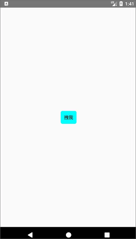
3.draggable-拖拽
draggable让组件可以响应拖动:
fun Modifier.draggable(
    state: DraggableState,
    orientation: Orientation,// 水平还是竖直方向
    enabled: Boolean = true,
    interactionSource: MutableInteractionSource? = null,
    startDragImmediately: Boolean = false,//是否立即拖动,防止其他手势检测器对“向下”事件做出反应
    onDragStarted: suspend CoroutineScope.(startedPosition: Offset) -> Unit = {},//拖动开始
    onDragStopped: suspend CoroutineScope.(velocity: Float) -> Unit = {},//拖动结束
    reverseDirection: Boolean = false//是否反转方向
)
例子:
@Preview
@Composable
fun MyDraggable() {
    var offset by remember { mutableStateOf(0f) }
    val state = rememberDraggableState(onDelta = { delta ->
        offset += delta
    })
    Box(
        modifier = Modifier.fillMaxSize(),
        contentAlignment = Alignment.Center
    ) {
        Text(
            text = "拽我",
            modifier = Modifier
                .offset { IntOffset(offset.roundToInt(), 0) }//偏移组件
                .draggable(
                    state = state,
                    orientation = Orientation.Horizontal,// 水平拖拽
                )
                .background(Color.Cyan, RoundedCornerShape(5.dp))
                .padding(10.dp)
        )
    }
}
效果:
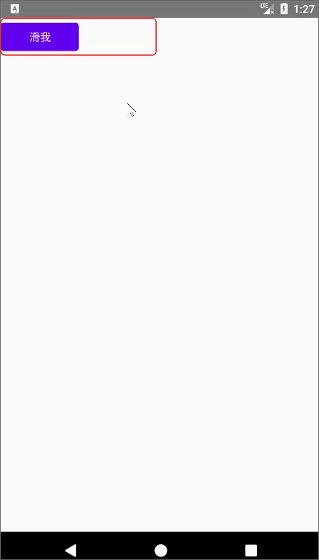
4.swipeable-滑动
swipeable类似于Switch的效果,可以定义多个锚点,以及判定切换锚点滑动的阈值:
@ExperimentalMaterialApi
fun  Modifier.swipeable(
    state: SwipeableState,
    anchors: Map,// 锚点集合
    orientation: Orientation,// 可滑动的方向
    enabled: Boolean = true,
    reverseDirection: Boolean = false,
    interactionSource: MutableInteractionSource? = null,
    thresholds: (from: T, to: T) -> ThresholdConfig = { _, _ -> FixedThreshold(56.dp) },// 滑动阈值,超于多少就滑动到下个锚点,反之则滑回来
    resistance: ResistanceConfig? = resistanceConfig(anchors.keys),
    // 滑动手指放开时,距离阈值没达到,但加速度达到阈值,则切换到下个锚点
    velocityThreshold: Dp = VelocityThreshold
)
例子:
@OptIn(ExperimentalMaterialApi::class)
@Preview
@Composable
fun MySwipeable() {
    // 表示运行到哪个锚点的状态
    val swipeableState = rememberSwipeableState(initialValue = 0)
    val width = 100.dp

    Box(
        modifier = Modifier
            .width(200.dp)
            .border(
                1.dp,
                Color.Red,
                RoundedCornerShape(5.dp)
            )
            .swipeable(
                state = swipeableState,
                anchors = mapOf(//锚点集合,表示每个锚点滑动的距离
                    0f to 0,
                    with(LocalDensity.current) {//dp->px
                        width.toPx()
                    } to 1),
                orientation = Orientation.Horizontal//水平滑动
            ),
        contentAlignment = Alignment.TopStart
    ) {
        Button(
            onClick = { /*TODO*/ },
            modifier = Modifier
                .offset { IntOffset(swipeableState.offset.value.roundToInt(), 0) }// 根据滑动状态进行偏移操作
                .width(width) // 按钮宽度也设置为100dp
        ) {
            Text(text = "滑我", color = Color.White)
        }
    }
}
效果:
三、对齐方式
除了前面介绍布局时每个布局自带属性的对齐方式外,Modifier也为各个不同的布局作用域(BoxScope、RowScope、ColumnScope)设置了单独的布局方式,在这些作用域中,我们可以使用下面的对齐方式
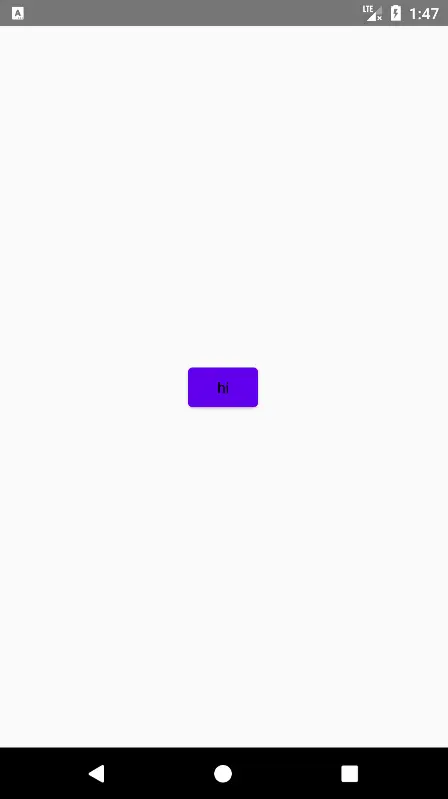
1.BoxScope
align:将内容元素拉取到 Box 中的特定 Alignment
例子:
@Preview
@Composable
fun MyBoxScope() {
    Box(modifier = Modifier.fillMaxSize()) {
        Button(
            onClick = { /*TODO*/ },
            modifier = Modifier.align(Alignment.Center)//将组件位于Box的中央
        ) {
            Text(text = "hi")
        }
    }
}
效果:
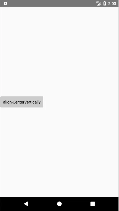
2.RowScope
2.1 align
align:设置元素在Row中的垂直对齐方式:Top顶部、CenterHorizontally垂直居中、End底部
例子:
@Preview
@Composable
fun MyRowScope() {
    Row(modifier = Modifier.fillMaxSize()) {
        Text(
            text = "align-CenterVertically",
            modifier = Modifier
                .align(Alignment.CenterVertically)
                .background(Color.LightGray, RoundedCornerShape(3.dp))
                .padding(10.dp)
        )
    }
}
效果:
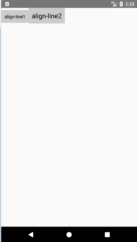
2.2 alignBy
alignBy:使其 alignmentLine 与同样配置为 alignBy 的同级元素对齐。
例子:
@Preview
@Composable
fun MyRowScope2() {
    Row(modifier = Modifier.fillMaxSize()) {
        Text(
            text = "align-line1",
            modifier = Modifier
                .alignBy(FirstBaseline)
                .background(Color.LightGray, RoundedCornerShape(3.dp))
                .padding(10.dp)
        )
        Text(
            text = "align-line2",
            fontSize = 20.sp,
            modifier = Modifier
                .alignBy(FirstBaseline)
                .background(Color.LightGray, RoundedCornerShape(3.dp))
                .padding(10.dp)
        )
    }
}
效果:
ColumnScope也是差不多的使用方式,这边就不做多介绍了
四、动画
1.animateItemPlacement
animateItemPlacement是作用于列表组件下的作用域中,可为列表Item元素添加动画效果
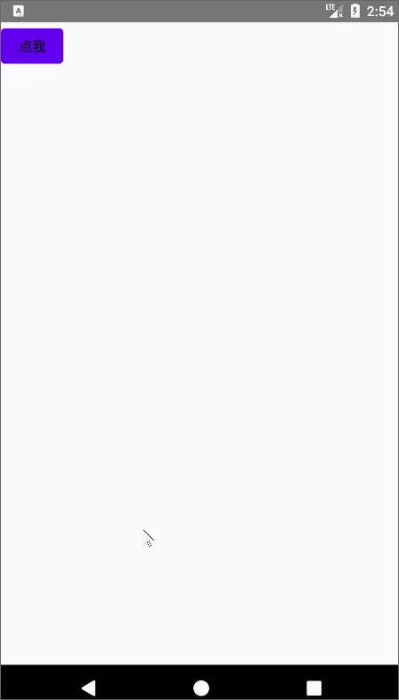
2.animateEnterExit
animateEnterExit:在AnimatedVisibilityScope动画可见作用域中自定义进入和出去的动画效果
例子:
@OptIn(ExperimentalAnimationApi::class)
@Preview
@Composable
fun MyAnimeScope() {
    var visible by remember { mutableStateOf(false) }

    Row(modifier = Modifier.fillMaxSize()) {
        Button(onClick = { visible = !visible }) {
            Text(text = "点我")
        }

        // 带动画的效果组件
        AnimatedVisibility(visible = visible) {
            Icon(
                Icons.Default.Info, contentDescription = null,
                // 自己指定进入和出去的动画
                modifier = Modifier.animateEnterExit(enter = scaleIn(), exit = scaleOut())
            )
        }
    }
}
效果:
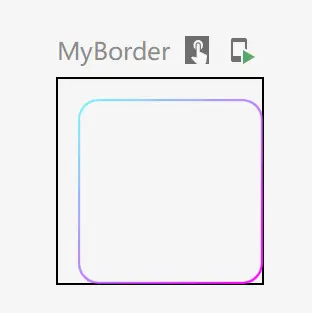
五、边框
border:可以为组件加上一个边框,需要指定Shape背景形状,还支持Brush(Shader(点击跳转详情))
例子:
@Preview
@Composable
fun MyBorder() {
    Box(
        modifier = Modifier
            .size(100.dp)
            .padding(start = 10.dp, top = 10.dp)
            .border(
                1.dp,// 边框粗细1dp
                Brush.linearGradient(
                    0f to Color.Cyan.copy(alpha = 0.5f),
                    1f to Color.Magenta
                ),// 线性渲染
                RoundedCornerShape(10.dp)// 形状带圆角
            )
    )
}
预览效果:
六、绘图
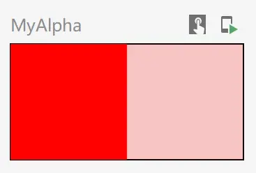
1.alpha
alpha直接改变该组件的透明度:
@Preview
@Composable
fun MyAlpha() {
   Row {
       Box(
           modifier = Modifier
               .background(Color.Red)
               .size(50.dp)
       ) {

       }

       Box(
           modifier = Modifier
               .alpha(0.2f)
               .background(Color.Red)
               .size(50.dp)
       ) {

       }
   }
}
预览效果:
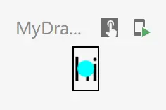
2.drawBehind
drawBehind提供一个画布,用于在绘制在内容后方:
@Preview
@Composable
fun MyDrawBehind() {
    Text(
        text = "hi",
        modifier = Modifier.drawBehind {
            // 画个圆形背景
            drawCircle(color = Color.Cyan, 10f)
        }
    )
}
预览效果:
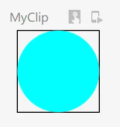
3.clip
clip是将组件内容显示的画布进行裁剪,不可与background同时使用:
@Preview
@Composable
fun MyClip() {
    Box(modifier = Modifier.clip(CircleShape)) {
        Box(
            Modifier
                .size(50.dp)
                .background(color = Color.Cyan))
    }
}
预览效果:
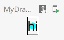
4.drawWithContent
drawWithContent允许开发者在布局内容前后进行绘制,通过drawContent()方法绘制内容:
@Preview
@Composable
fun MyDrawWithContent() {
    Text(
        text = "hi",
        modifier = Modifier.drawWithContent {
            // 先绘制内容
            this.drawContent()
            // 画个圆形背景
            drawCircle(color = Color.Cyan, 10f)
        }
    )
}
预览效果:
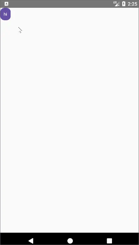
5.indication
indication为交互设置效果,如水波纹,该效果在前面clickable等操作中也可以设置,pointerInput在后续指针中:
@Preview
@Composable
fun MyIndication() {
    val interactionSource = remember { MutableInteractionSource() }

    Text(
        text = "hi",
        modifier = Modifier
            .indication(
                interactionSource = interactionSource,
                indication = rememberRipple(color = Color.Red) //红色水波纹
            )
            // 添加手势
            .pointerInput(interactionSource, true) {
                this.detectTapGestures(
                    // 按下事件
                    onPress = { offset ->
                        val pressInteraction = PressInteraction.Press(offset)
                        // 触发水波纹
                        interactionSource.emit(pressInteraction)
                    }
                )
            }
            .size(100.dp),
        textAlign = TextAlign.Center
    )
}
效果:
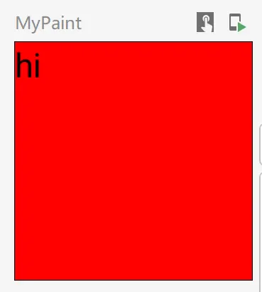
6.paint
paint允许传入一个painter画笔,来对整个组件进行渲染:
fun Modifier.paint(
    painter: Painter,
    sizeToIntrinsics: Boolean = true,
    alignment: Alignment = Alignment.Center,
    contentScale: ContentScale = ContentScale.Inside,
    alpha: Float = DefaultAlpha,
    colorFilter: ColorFilter? = null
)
例子:
@Preview
@Composable
fun MyPaint() {
    // 红色画笔
    val painter = ColorPainter(Color.Red)

    Box(modifier = Modifier.size(100.dp).paint(painter = painter)) {
        Text("hi")
    }
}
预览效果:
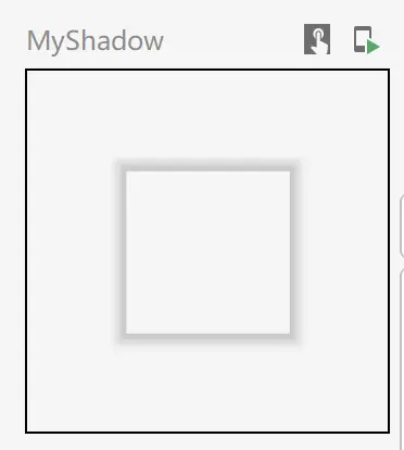
7.shadow
shadow为组件设置一个阴影:
@Stable
fun Modifier.shadow(
    elevation: Dp,// 阴影大小
    shape: Shape = RectangleShape, //形状
    clip: Boolean = elevation > 0.dp,
    ambientColor: Color = DefaultShadowColor,
    spotColor: Color = DefaultShadowColor,
)
例子:
@Preview
@Composable
fun MyShadow() {
    Box(
        modifier = Modifier
            .size(100.dp),
        contentAlignment = Alignment.Center
    ) {
        Box(
            modifier = Modifier
                .size(50.dp)
                .shadow(2.dp)
        ) {

        }
    }
}
预览效果:
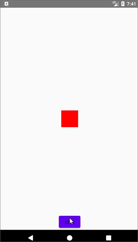
七、焦点
1.onFocusChanged
onFocusChanged可以监听组件焦点的变化,需要和focusRequester、focusable配合使用:
@Preview
@Composable
fun MyFocus() {
    var focused by remember { mutableStateOf(false) }
    val focusRequester = remember { FocusRequester() }

    Box(
        modifier = Modifier.fillMaxSize(),
        contentAlignment = Alignment.Center
    ) {
        Box(
            modifier = Modifier
                .focusRequester(focusRequester)//绑定焦点请求者
                .onFocusChanged { focusStat ->
                    focused = focusStat.isFocused
                }
                .focusable()
                .size(50.dp)
                .background(if (focused) Color.Cyan else Color.Red)
        ) {

        }

        Button(
            onClick = { focusRequester.requestFocus() },//点击触发焦点获取
            modifier = Modifier.align(Alignment.BottomCenter)
        ) {
            Text("click")
        }
    }
}
效果:
八、布局
1.layout
使用layout摆放组件,和传统的自定义控件一样,layout是用于摆放位置的,下面小程序实现功能为基于baseLine进行一个偏移,最后通过重新
fun Modifier.baseLineToTop(
    dp: Dp
) = this.then(//当前Modifier进行组合
    layout { measurable, constraints ->
        // 预先测量下组件
        val placeable = measurable.measure(constraints)
        // 获取baseline,为baseline到组件顶部的距离
        val baseLine = placeable[FirstBaseline]
        // 偏移后,组件的高度 = 原有高度+偏移量-baseline
        val height = placeable.height + dp.roundToPx() - baseLine
        // 重新定义组件的整体宽高
        layout(placeable.width, height) {
            //重新摆放组件,y轴进行偏移
            placeable.placeRelative(0, dp.roundToPx() - baseLine)
        }
    }
)

@Preview
@Composable
fun MyCustomLayoutModifier() {
    Row {
        Text(
            "hi",
            modifier = Modifier.baseLineToTop(24.dp)
        )

        Spacer(modifier = Modifier.width(20.dp))

        Text(
            "hi"
        )
    }
}
预览效果:
九、内边距
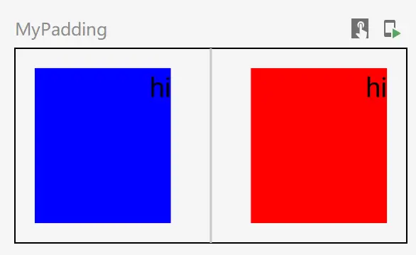
1.absolutePadding
absolutePadding和padding的区别在于,absolutePadding总认为是从左往右,从上往下摆放控件的,CompositionLocal会在后续进行介绍:
@Preview
@Composable
fun MyPadding() {
    CompositionLocalProvider(LocalLayoutDirection provides LayoutDirection.Rtl) {// 从右往左摆放组件
        Row(modifier = Modifier.height(IntrinsicSize.Min)) {
            Box(
                modifier = Modifier
                    .size(100.dp)
                    .padding(10.dp, 10.dp, 20.dp, 10.dp)
                    .background(Color.Red)
            ) {
                Text("hi")
            }
            Divider(
                modifier = Modifier
                    .width(1.dp)
                    .fillMaxHeight()
            )
            Box(
                modifier = Modifier
                    .size(100.dp)
                    .absolutePadding(10.dp, 10.dp, 20.dp, 10.dp)
                    .background(Color.Blue)
            ) {
                Text("hi")
            }
        }
    }
}
预览效果,由于进行了反转,蓝色才是使用了absolutePadding:
十、指针
除了操作中介绍的几种改变组件交互效果外,还可以使用pointerInput来自定义更自由的操作,它包含了一切触摸事件的监听,并且后续的效果由你自己定义
1.pointerInput
pointerInput就是处理触摸事件的一个修饰,官方推荐传入一个key,来确定何时取消上次的处理
@Preview
@Composable
fun MyPointer() {
    var offsetX by remember { mutableStateOf(0f) }
    var offsetY by remember { mutableStateOf(0f) }

    Box(modifier = Modifier.fillMaxSize()) {
        Text(
            text = "hi",
            color = Color.White,
            modifier = Modifier
                .offset { IntOffset(offsetX.roundToInt(), offsetY.roundToInt()) }
                .background(
                    MaterialTheme.colorScheme.primary,
                    MaterialTheme.shapes.medium
                )
                .padding(10.dp)
                .pointerInput(Unit) {
                    detectTransformGestures { centroid: Offset, pan: Offset, zoom: Float, rotation: Float ->
                        pan.apply {
                            offsetX += x
                            offsetY += y
                        }
                    }
                },
            style = MaterialTheme.typography.labelMedium
        )
    }
}
效果:
十一、变换
变换的效果包含:旋转,缩放,以及上面使用过的平移
1.rotate
rotate传入一个角度,以旋转组件:
@Preview
@Composable
fun MyTrans() {
    var rotationState by remember { mutableStateOf(0f) }

    Box(
        modifier = Modifier
            .rotate(rotationState)
            .padding(10.dp)
            .size(300.dp)
            .background(Color.Red)
            .pointerInput(Unit) {
                detectTransformGestures { centroid: Offset, pan: Offset, zoom: Float, rotation: Float ->
                    rotationState += rotation
                }
            }
    )
}
效果:

2.scale
scale可以将组件进行缩放
@Preview
@Composable
fun MyTrans2() {
    var scaleState by remember { mutableStateOf(1f) }

    Box(
        modifier = Modifier
            .scale(scaleState)
            .padding(10.dp)
            .size(300.dp)
            .background(Color.Red)
            .pointerInput(Unit) {
                detectTransformGestures { centroid: Offset, pan: Offset, zoom: Float, rotation: Float ->
                    scaleState *= zoom
                }
            }
    )
}
效果:

十一、图形
graphicsLayer就是有关组件显示的一切状态,包含了所有变换效果、透明度、背景shape、阴影,配合transformable能够对变换进行快速的处理:
fun Modifier.graphicsLayer(
    scaleX: Float,
    scaleY: Float,
    alpha: Float,
    translationX: Float,
    translationY: Float,
    shadowElevation: Float,
    rotationX: Float,
    rotationY: Float,
    rotationZ: Float,
    cameraDistance: Float,
    transformOrigin: TransformOrigin,
    shape: Shape,
    clip: Boolean,
    renderEffect: RenderEffect?,
    ambientShadowColor: Color,
    spotShadowColor: Color
)
例子:
@Preview
@Composable
fun MyGraphicsLayer() {
    var scale by remember { mutableStateOf(1f) }
    var rotation by remember { mutableStateOf(0f) }
    var offset by remember { mutableStateOf(Offset.Zero) }
    val transformState =
        rememberTransformableState { zoomChange: Float, panChange: Offset, rotationChange: Float ->
            scale *= zoomChange
            rotation += rotationChange
            offset += panChange
        }

    Box(
        modifier = Modifier
            .graphicsLayer {
                scaleX = scale
                scaleY = scale
                rotationZ = rotation
                translationX = offset.x
                translationY = offset.y
            }
            .padding(10.dp)
            .size(300.dp)
            .background(Color.Red)
            .transformable(transformState)
    )
}
效果:
十二、滚动
Modifier还能为组件添加可以滚动的支持,以及内嵌滚动、根据滚动状态显示或隐藏组件的支持
1.verticalScroll
verticalScroll可以让组件支持竖直滑动:
@Preview
@Composable
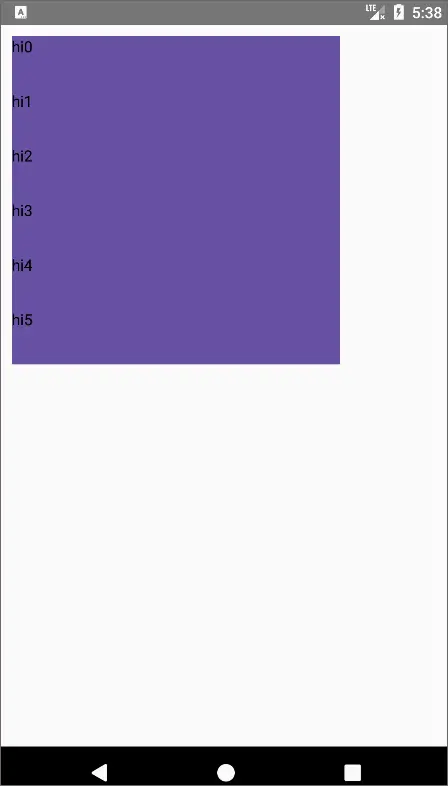
fun MyScrollable() {
val state = rememberScrollState()
Column(
modifier = Modifier
.padding(10.dp)
.size(300.dp)
.background(MaterialTheme.colorScheme.primary)
.verticalScroll(state)
) {
repeat(10) { index ->
Text(text = "hi${index}", modifier = Modifier.height(50.dp))
}
}
}
效果:
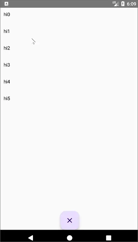
2.overscroll
overscroll就是给组件加上滚动到边缘的效果:
@OptIn(ExperimentalFoundationApi::class)
@Preview
@Composable
fun MyScrollable2() {
    val state = rememberScrollState()

    Box(modifier = Modifier.fillMaxSize()) {
        Column(
            modifier = Modifier
                .padding(10.dp)
                .size(300.dp)
                .verticalScroll(state)
                .overscroll(ScrollableDefaults.overscrollEffect())//滑动到顶部和底部的涟漪效果
        ) {
            repeat(50) { index ->
                Text(text = "hi${index}", modifier = Modifier.height(50.dp))
            }
        }

        ExtendedFloatingActionButton(
            text = { Text(text = "点我") },
            icon = { Icon(Icons.Default.Close, contentDescription = null) },
            onClick = { /*TODO*/ },
            expanded = state.isScrollInProgress,
            modifier = Modifier.align(Alignment.BottomCenter)
        )
    }
}
效果:
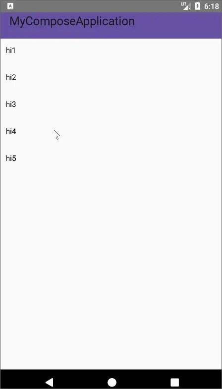
3.nestedScroll
nestedScroll将内容组件的滑动事件进行分享,以达到联动的效果:
@OptIn(ExperimentalFoundationApi::class, ExperimentalMaterial3Api::class)
@Preview
@Composable
fun MyScrollable3() {
    val state = rememberScrollState()

    val toolbarHeight = 48.dp
    val toolbarHeightPx = with(LocalDensity.current) { toolbarHeight.roundToPx().toFloat() }
    val toolbarOffsetHeightPx = remember { mutableStateOf(0f) }
    val nestedScrollConnection = remember {
        object : NestedScrollConnection {
            override fun onPreScroll(available: Offset, source: NestedScrollSource): Offset {
                //y方向的偏移量
                val delta = available.y
                val newOffset = toolbarOffsetHeightPx.value + delta
                toolbarOffsetHeightPx.value = newOffset.coerceIn(-toolbarHeightPx, 0f)
                return Offset.Zero
            }
        }
    }

    Box(
        modifier = Modifier
            .fillMaxSize()
            .nestedScroll(nestedScrollConnection)
    ) {
        Column(
            modifier = Modifier
                .padding(10.dp)
                .size(300.dp)
                .verticalScroll(state)
                .overscroll(ScrollableDefaults.overscrollEffect())//滑动到顶部和底部的涟漪效果
        ) {
            repeat(50) { index ->
                Text(text = "hi${index}", modifier = Modifier.height(50.dp))
            }
        }

        TopAppBar(
            modifier = Modifier
                .height(toolbarHeight)
                .offset { IntOffset(x = 0, y = toolbarOffsetHeightPx.value.roundToInt()) },
            title = {
                Text(
                    stringResource(id = R.string.app_name)
                )
            },
            colors = TopAppBarDefaults.smallTopAppBarColors(containerColor = MaterialTheme.colorScheme.primary)
        )
    }
}
效果:
十三、其他
其他再列举一些常用的修饰
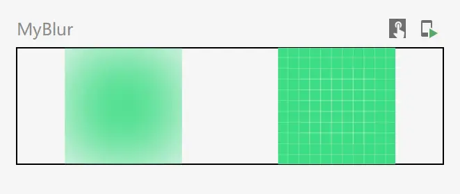
1.blur
blur实现模糊滤镜效果,效果参考传统安卓处理方式:Android滤镜–Alpha值滤镜处理之MaskFilter
@Preview
@Composable
fun MyBlur() {
    Row(horizontalArrangement = Arrangement.SpaceAround, modifier = Modifier.fillMaxWidth()) {

        Image(
            painter = painterResource(id = R.drawable.ic_launcher_background),
            contentDescription = null,
            modifier = Modifier.blur(50.dp)
        )

        Image(
            painter = painterResource(id = R.drawable.ic_launcher_background),
            contentDescription = null
        )
    }
}
预览效果:
2.pullRefresh
pullRefresh让组件支持下拉刷新,配合PullRefreshState来显示PullRefreshIndicator刷新指示器:
@OptIn(ExperimentalFoundationApi::class, ExperimentalMaterialApi::class)
@Preview
@Composable
fun MyPullRefresh() {
    val state = rememberScrollState()
    var refreshing by remember { mutableStateOf(false) }
    val scope = rememberCoroutineScope()
    val refreshState = rememberPullRefreshState(
        refreshing = refreshing,
        onRefresh = {
            scope.launch {
                refreshing = true
                delay(1500)
                refreshing = false
            }
        }
    )

    Box(
        modifier = Modifier.pullRefresh(refreshState) //下拉刷新
    ) {
        Column(
            modifier = Modifier
                .padding(10.dp)
                .size(300.dp)
                .verticalScroll(state)
                .overscroll(ScrollableDefaults.overscrollEffect())//滑动到顶部和底部的涟漪效果

        ) {
            repeat(50) { index ->
                Text(text = "hi${index}", modifier = Modifier.height(50.dp))
            }
        }

        PullRefreshIndicator(// 刷新指示器
            refreshing,
            refreshState,
            modifier = Modifier.align(Alignment.TopCenter)
        )
    }
}
效果:
1、本站所有资源均从互联网上收集整理而来,仅供学习交流之用,因此不包含技术服务请大家谅解!
2、本站不提供任何实质性的付费和支付资源,所有需要积分下载的资源均为网站运营赞助费用或者线下劳务费用!
3、本站所有资源仅用于学习及研究使用,您必须在下载后的24小时内删除所下载资源,切勿用于商业用途,否则由此引发的法律纠纷及连带责任本站和发布者概不承担!
4、本站站内提供的所有可下载资源,本站保证未做任何负面改动(不包含修复bug和完善功能等正面优化或二次开发),但本站不保证资源的准确性、安全性和完整性,用户下载后自行斟酌,我们以交流学习为目的,并不是所有的源码都100%无错或无bug!如有链接无法下载、失效或广告,请联系客服处理!
5、本站资源除标明原创外均来自网络整理,版权归原作者或本站特约原创作者所有,如侵犯到您的合法权益,请立即告知本站,本站将及时予与删除并致以最深的歉意!
6、如果您也有好的资源或教程,您可以投稿发布,成功分享后有站币奖励和额外收入!
7、如果您喜欢该资源,请支持官方正版资源,以得到更好的正版服务!
8、请您认真阅读上述内容,注册本站用户或下载本站资源即您同意上述内容!
原文链接:https://www.dandroid.cn/19381,转载请注明出处。


评论0