注:解决方式在最后。
一、问题复现
Compose Desktop,AlertDialog代码如下:
        AlertDialog(
            modifier = Modifier
                .clip(RoundedCornerShape(10.dp))
                .fillMaxHeight(0.3f)
                .fillMaxWidth(0.35f)
                .background(Color.White)
                .padding(20.dp),
            title = null,
            text = { /* 略 */ },
            buttons = { /* 略 */ }
        )
这里设置了RoundCornerShape圆角,弹出的对话框如图:
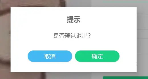
image.png
发现是没有圆角的。根据网上查到的信息,设置 AlertDialog 的背景为透明,无效。
当我给这个dialog设置背景色,如:
AlertDialog(
            modifier = Modifier
                .clip(RoundedCornerShape(10.dp))
                .fillMaxHeight(0.3f)
                .fillMaxWidth(0.35f)
                .background(Color.Red)  // 设置背景色为红色
                .padding(20.dp),
            title = null,
            text = { /* 略 */ },
            buttons = { /* 略 */ }
        )
结果如图:
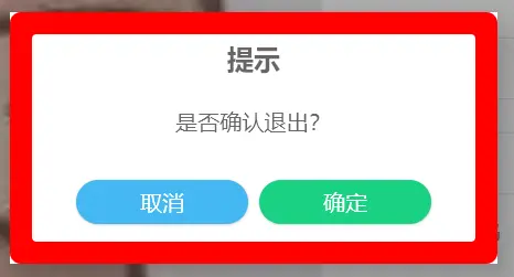
image.png
可以看出,这多半是 AlertDialog 父组件的背景色,而不是 AlertDialog 自身的原因。
二、原因分析
根据 AlertDialog 的源码来看,其界面是通过 dialogProvider 来提供的。
fun AlertDialog(
    onDismissRequest: () -> Unit,
    buttons: @Composable () -> Unit,
    modifier: Modifier = Modifier,
    title: (@Composable () -> Unit)? = null,
    text: @Composable (() -> Unit)? = null,
    shape: Shape = MaterialTheme.shapes.medium,
    backgroundColor: Color = MaterialTheme.colors.surface,
    contentColor: Color = contentColorFor(backgroundColor),
    dialogProvider: AlertDialogProvider = PopupAlertDialogProvider
) {
    with(dialogProvider) {
        AlertDialog(onDismissRequest = onDismissRequest) {
            AlertDialogContent(
                buttons = buttons,
                modifier = modifier.width(IntrinsicSize.Min),
                title = title,
                text = text,
                shape = shape,
                backgroundColor = backgroundColor,
                contentColor = contentColor
            )
        }
    }
}
而 dialogProvider 的默认实现是 PopupAlertDialogProvider,其中界面部分的代码如下:
Box(
    modifier = Modifier
        .fillMaxSize()
        .background(scrimColor)
        .pointerInput(onDismissRequest) {
            detectTapGestures(onPress = { onDismissRequest() })
        },
    contentAlignment = Alignment.Center
) {
    Surface(Modifier.pointerInput(onDismissRequest) {
        detectTapGestures(onPress = {
            // Workaround to disable clicks on Surface background https://github.com/JetBrains/compose-jb/issues/2581
        })
    }, elevation = 24.dp) {
        content()
    }
}
其中,对话框就是其中的 Surface 部分。而 Surface 的默认背景颜色就是白色。
问题找到了,就好解决了。
三、解决
- 新建一个
CustomDialogProvider,并复制PopupAlertDialogProvider的代码。
将其中的Surface背景改为透明。
import androidx.compose.foundation.background
import androidx.compose.foundation.gestures.detectTapGestures
import androidx.compose.foundation.layout.Box
import androidx.compose.foundation.layout.fillMaxSize
import androidx.compose.material.AlertDialogProvider
import androidx.compose.material.ExperimentalMaterialApi
import androidx.compose.material.Surface
import androidx.compose.runtime.Composable
import androidx.compose.ui.Alignment
import androidx.compose.ui.Modifier
import androidx.compose.ui.awt.awtEventOrNull
import androidx.compose.ui.graphics.Color
import androidx.compose.ui.input.key.KeyEventType
import androidx.compose.ui.input.key.type
import androidx.compose.ui.input.pointer.pointerInput
import androidx.compose.ui.unit.*
import androidx.compose.ui.window.Popup
import androidx.compose.ui.window.PopupPositionProvider
import java.awt.event.KeyEvent

@OptIn(ExperimentalMaterialApi::class)
object CustonDialogProvider : AlertDialogProvider {
    @Composable
    override fun AlertDialog(onDismissRequest: () -> Unit, content: @Composable () -> Unit) {
        // Popups on the desktop are by default embedded in the component in which
        // they are defined and aligned within its bounds. But an [AlertDialog] needs
        // to be aligned within the window, not the parent component, so we cannot use
        // [alignment] property of [Popup] and have to use [Box] that fills all the
        // available space. Also [Box] provides a dismiss request feature when clicked

        // outside of the [AlertDialog] content.
        Popup(
            popupPositionProvider = object : PopupPositionProvider {
                override fun calculatePosition(
                    anchorBounds: IntRect,
                    windowSize: IntSize,
                    layoutDirection: LayoutDirection,
                    popupContentSize: IntSize
                ): IntOffset = IntOffset.Zero
            },
            focusable = true,
            onDismissRequest = onDismissRequest,
            onKeyEvent = {
                if (it.type == KeyEventType.KeyDown && it.awtEventOrNull?.keyCode == KeyEvent.VK_ESCAPE) {
                    onDismissRequest()
                    true
                } else {
                    false
                }
            },
        ) {
            val scrimColor = Color.Black.copy(alpha = 0.32f) //todo configure scrim color in function arguments
            Box(
                modifier = Modifier
                    .fillMaxSize()
                    .background(scrimColor)
                    .pointerInput(onDismissRequest) {
                        detectTapGestures(onPress = { onDismissRequest() })
                    },
                contentAlignment = Alignment.Center
            ) {
                Surface(
                    Modifier.pointerInput(onDismissRequest) {
                        detectTapGestures(onPress = {
                            // Workaround to disable clicks on Surface background
                        })
                    },
                    elevation = 24.dp,
                    color = Color.Transparent  // 修改背景色为透明
                ) {
                    content()
                }
            }
        }
    }
}
- 在 AlertDialog 参数中,加入自定义的 DialogProvider。
        AlertDialog(
            modifier = Modifier
                .clip(RoundedCornerShape(10.dp))
                .fillMaxHeight(0.3f)
                .fillMaxWidth(0.35f)
                .background(Color.White)
                .padding(20.dp),
            dialogProvider = CustonDialogProvider,  // 添加自定义的 DialogProvider
            title = null,
            text = { /* 略 */ },
            buttons = { /* 略 */ }
        )
再次运行代码,发现圆角正常显示了:
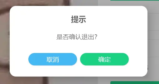
image.png
当然,我们也可以通过在 Theme 中设置 Surface 的颜色,达到相同的效果:
    MaterialTheme(colors = MaterialTheme.colors.copy(surface = Color.Transparent)) {
        // 略
    }
不过这样就会改变所有Surface 的颜色了。
下载说明:
1、本站所有资源均从互联网上收集整理而来,仅供学习交流之用,因此不包含技术服务请大家谅解!
2、本站不提供任何实质性的付费和支付资源,所有需要积分下载的资源均为网站运营赞助费用或者线下劳务费用!
3、本站所有资源仅用于学习及研究使用,您必须在下载后的24小时内删除所下载资源,切勿用于商业用途,否则由此引发的法律纠纷及连带责任本站和发布者概不承担!
4、本站站内提供的所有可下载资源,本站保证未做任何负面改动(不包含修复bug和完善功能等正面优化或二次开发),但本站不保证资源的准确性、安全性和完整性,用户下载后自行斟酌,我们以交流学习为目的,并不是所有的源码都100%无错或无bug!如有链接无法下载、失效或广告,请联系客服处理!
5、本站资源除标明原创外均来自网络整理,版权归原作者或本站特约原创作者所有,如侵犯到您的合法权益,请立即告知本站,本站将及时予与删除并致以最深的歉意!
6、如果您也有好的资源或教程,您可以投稿发布,成功分享后有站币奖励和额外收入!
7、如果您喜欢该资源,请支持官方正版资源,以得到更好的正版服务!
8、请您认真阅读上述内容,注册本站用户或下载本站资源即您同意上述内容!
原文链接:https://www.dandroid.cn/19410,转载请注明出处。

评论0